Do you know when your potential customer’s first interaction with you is? It is when they land on your landing page. There can be many routes for them to land on your website. They may have clicked on a link they found on social media posts, or they may have searched for services similar to yours, which led them to your website. No matter their route, they will come to your landing page.
This is where you can win them over and push them to make the actions you want them to take. Therefore, if your landing page is not impressive, you may lose many potential customers. In this article, we will learn all there is to know about what is a high-converting landing page and what steps you can take to maximize results.
What Is A Landing Page?
Simply put, a landing page is a dock where all your leads come from. During your marketing campaign, you may use different marketing strategies that bring interested customers straight to your website and, more exclusively, your landing page. You can link your landing page to the CTA you post in your marketing campaigns.
Once potential leads make their way to you and land on your landing page, you are responsible for nurturing the lead. This is why; you need to be very concerned about creating your landing pages as engaging as possible. You need landing pages that convert; it is not easy to do that.
Read also: Inbound Marketing Funnel Complete Guide
What Makes a High-Converting Landing Page?
As a business owner, you must be worried about why landing pages are not converting those unfamiliar. The concept will not understand the differences between a landing page that converts and one that does not convert.
Therefore, it is only fair to question what makes a landing page convert. Here are some elements that contribute significantly to the conversion of leads on a landing page.
Read also: Customer Acquisition Channels Comprehensive Guide
Headlines
The first thing visitors will see on your landing page is the headline. Your headline should be able to immediately grab the attention of your reader. You mustn’t lose focus of what is important when creating an engaging headline, which is to create a headline that tells your visitors what your business is about.
At first glance, your visitors should be able to know what you offer, and you can use this space to incorporate keywords, as those are the words most commonly used when looking for a similar service.
Moreover, when creating a headline, you must ensure that it is short and impactful. Ideally, the headline should be under 10 words.
Subheadings
While the purpose of headlines is to create an element of excitement and curiosity in the readers, the subheading is used to add further explanation. Using the subheading, you can talk about the most prominent features of your audience that will satisfy some of their curiosity but will keep them wanting more.
This way, you can nurture the lead properly and ensure that your visitor reads through the rest of the landing page.
Visual Elements
Visual elements grab more attention than written content; therefore, you need to pay attention to what visuals you can include. The main purpose of visual elements is to give your customers a visual representation of what they can expect from your company. Using the right colors and bright images can be very attention-grabbing, and the users will be more interested in what you have to offer.
A picture speaks a thousand words and you can easily convey your message to your audience using different images and photographs. You can ask your website designers and graphic designers to come up with visually pleasing elements such as videos and infographics and add them to your website strategically.
Value Content
The copy on your landing page is what is going to seal the deal. This is why your landing page’s copy has to be as effective as possible. To create an effective copy you need to ensure that the content is clear as day. You do not have to write a lot of content but must convey your message effectively.
Related article: What is Content Writing?
The content should be easy to read, short, and engaging. The entire purpose of your landing page is to grab and maintain the attention of those who land on the website. Talk about the features of your products and how they can change the life of your customers. You need to present your product as a solution for your customer’s pain points, so they are motivated to buy from you.
The landing page is your sales pitch, and you need to show your product in a positive light so you can make as many sales as possible.
Benefits
Does your product solve any problems your target audience may have? Then you can use that to your advantage. The benefits of your product are imperative in helping you make great sales. Your customers may not be able to see the benefits immediately, which is why you need to shed light on the benefits and explain how the benefits will change the life of your customers for the better.
Chat Options
When customers land on your landing page, you expect them to take the right action, and to push them towards that you need to provide support on the spot. You can’t be there physically, but you can include automated chatbots or set up a live agent system to nurture your leads by answering any questions they may have.
Having live chat options on your landing page will help your customers reach out to you in real-time if they have any questions. Prompt responses will push your customers to take the right steps and complete the sale.
Guarantees
Why should your customers buy from you? There need to be guarantees of service or products that can motivate your customers to make the purchase. You can include different things as a guarantee of your products and services, such as social media reviews, testimonies, and other guaranteed features you offer. Potential customers are more likely to trust other customers than the company itself. Therefore, to sell your customers on the idea of your product or service, you need to prove that other people have bought from you and enjoyed the experience.
It is best to include the guarantees on the landing page so your customers can take a look at them the first time they log on to your website.
Call To Action
After including all the other features on your landing page, you may have created an interest in your lead, but to put that lead into action, you need to do more. Add a call to action. The call to action is a button with an engaging phrase that leads your customers directly to the checkout form or sign-up.
When adding a call to action button, you need to be careful of different things. For instance, you must use the right color theme or font that is attention-grabbing so your leads can click on them instantly.
With your CTA you need to induce a sense of urgency. This will push your customers to take the action you want them to take.
Types of Landing Pages
Landing pages are used to convert leads into customers, and different landing pages can help with other purposes. Here are some types of landing pages you can use for your website:
Thank You
Showing gratitude is always a positive thing. When a customer makes a purchase or even if they simply fill out a form, thank them with a thank you landing page. Acknowledging the time and effort they set apart to fill out forms or place orders will help you win them over.
Referral

Customers who come to you with referrals should be redirected to a referral page. You can use this page to motivate them to bring in more customers.
Error 404
It can be very annoying to be redirected to a page not found message. You can add a polite message to ensure that it is not off-putting for customers. Try to incorporate humor on these pages so your visitors can have a little laugh. Moreover, you can add a button to take them back to the home page so they can keep browsing.
Lead Capturing
The main purpose of landing pages is to pull your customers into the sales funnel and get their details. The entire focus of the page is to get customer information that can help take them further down the sales funnel. Information can include the email address or other details that do not come off as invasive to your potential buyer persona.
People nowadays are very particular about the information they give out, so you need to tread carefully and ensure that you are not asking too much of your customers.
Splash
Do you have an interesting offer for your clients? Make a splash page. A splash landing page is a great way to make announcements that can help convert your leads. You can use them on special occasions so your customers can enjoy the festive feel and engage with the site.
Squeeze
Do you want to get that last bit of information from your customers before they go away? A squeeze page is what you need. With a squeeze page, you can extract that bit of information and then reach back to your customer when need be.
Sales
You surely want to sell your product, don’t you? With a sales landing page, you can easily do that. Come up with a sales landing page and include as much information as you possibly can. This way, you will be able to give out all the selling points of your product and convince your audience that they need this product.
Read also: B2B Sales Strategies to Win More Leads
High-Converting Landing Page Examples
Learning from successful examples is the best way forward. To create landing pages that convert, you must observe different websites and see how they hit the nail right on the head:
This landing page from Calm is a clear example of everything you should do right. Since this meditation application can help you sleep, the designers have incorporated that idea by choosing the right color theme. Other than that, the landing page gives you all the information you need right off the bat to get an idea of what the page is all about.
This landing page from Netflix includes most of the elements that are expected from a good landing page. The first headline gives away what the page is about, and the subheading adds more information. Moreover, the color scheme and the use of red for the CTA button are the driving elements of a landing page.
This landing page from Octopus CRM LinkedIn automation tool checks all the requirements for a converting landing page. With lots of visual elements and engaging content, it can grab visitors’ attention and deliver the message properly.
The landing page from Uber is an accurate representation of what you should expect from a landing page. This includes engaging copy, visual elements, and more that can convert leads into customers.
Tips to Create High-Converting Landing Pages
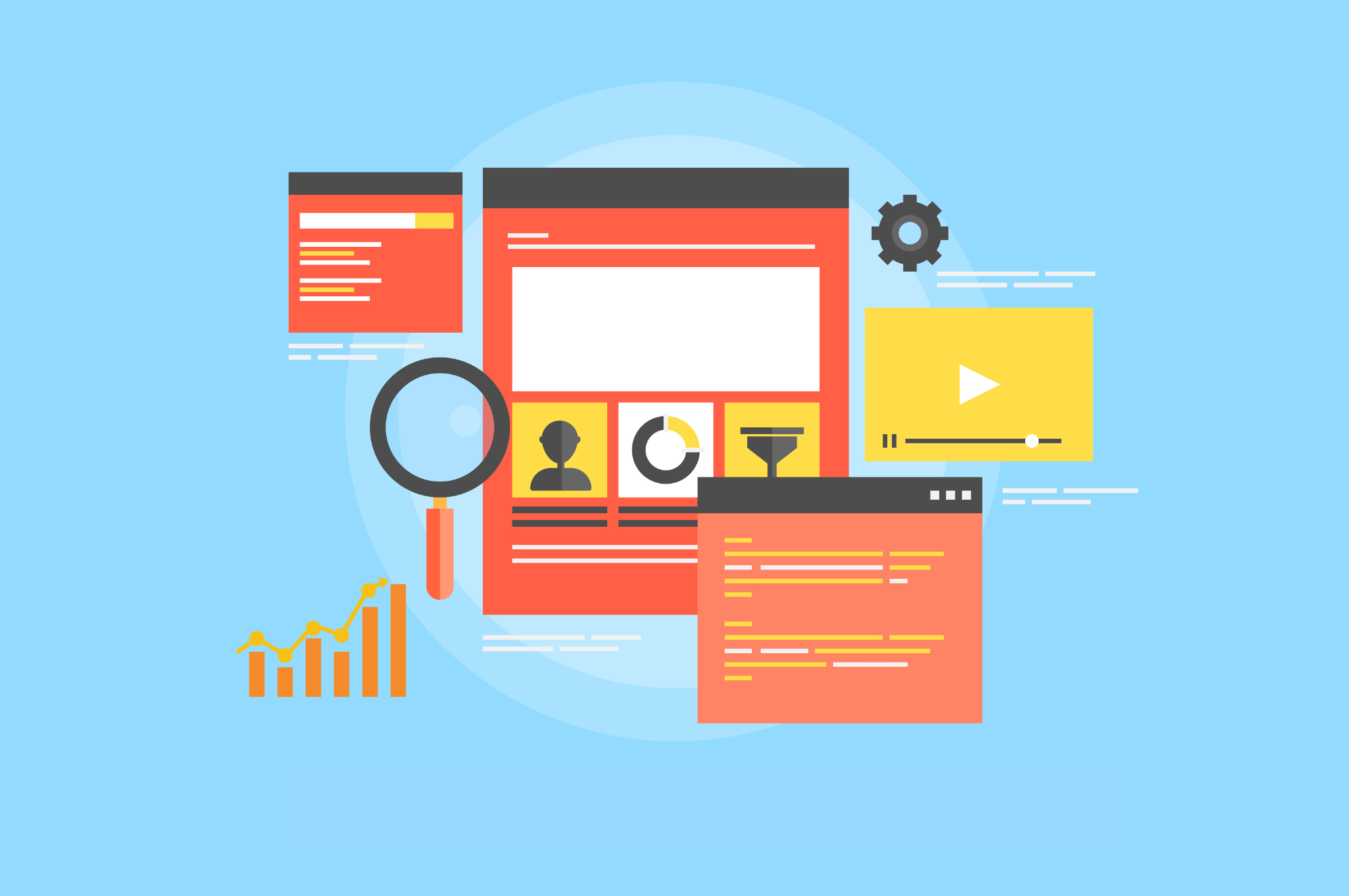
Do you wonder what the secrets behind creating high-converting landing pages are? Here are some tips that can help you with that.
Tip #1 – Keep Your CTA Where Your Leads Can Find It
Your customers should be able to find your CTA right away. Therefore, it is best to place it above the fold so that your leads can find it as soon as they land on the page.
Tip #2 – One CTA Is Enough
Flooding your landing page with a CTA is not a good idea at all. You do not want to force or overwhelm your leads to click on the CTA. This is why to maintain the level of impact; you must avoid using a lot of CTA. One CTA is enough.
Tip #3 – Stand Out With Your Propositions
You and hundreds of other websites are offering the same service or product; why should customers give their business to you? You must convince your audience that you are different from the crowd and can offer something that no one else does. Talk about some features of your business that are not commonly found elsewhere so that your customers know that they are getting more from you than your counterparts.
Tip #4 – Testimonials Are Important
Testimonies prove that customers have bought from you, and if you include their feedback, you will be able to convince your customers that you offer high-quality services. To give your customers a sense of security, you can include customer testimonies towards the end of the page so that by the time your customers reach the end of the landing page, they will be sold to your company and get connected with you immediately.
Tip #5 – Keep Your Forms Simple
Do not complicate your forms. Try to make them as easy to fill as possible so your potential customers do not have to struggle when filling them up and can easily add all the details. Customers often abandon forms if they are hard to fill.
Tip #6 – Show Your Security Certifications
Security is a prime concern for most visitors, and to ease their concerns, you can include your security badges on the page. This will help them believe that their information is protected and they do not have to worry about any security breach.
Tip #7 – Proofread, Proofread, Proofread

When writing the copy for your landing pages, you cannot afford to make grammatical mistakes or typos. Your customers will immediately lose interest if they find your content riddled with spelling and grammatical errors. They may deem you not qualified enough or capable of providing high-quality services. This is why, before uploading the content on the website, you must proofread it multiple times to ensure that it is perfect.
Tip #8 – Use Customer Pain points
When marketing your products or services, you need to consider the problems your customers face and then provide them with a solution: the product or service you offer.
When writing your landing page, you need to keep the customer pain points in mind and then try to target them on your landing page.
Tip #9 – Market It On Social Media
Add social media buttons on your landing page so your customers can click on them to get access to your social media profiles, and they can learn more about your business. Social media marketing can work two ways for your landing page. You can direct your customers from your landing page to your social media profiles or bring them in using the same social media pages.
Tip #10 – Highlight Value You Offer
With your landing page, you need to highlight the value you will be adding to your customers. They need to know what benefits they will get when they order from you, and the landing page is the best place to talk about that.
Tip #11 – Over Crowding
It is nice to include engaging content on your landing page but do not make the mistake of going overboard. The page should flow nicely, and your users should be able to read the content easily without being distracted by other things. Use the example of less is more when designing your landing page.
Tip #12 – Present Your Content Clearly
Do not leave things to your user’s imagination. When presenting your content, you must make sure that it is clear and that there is no confusion. The customers come to your landing page for answers; you shouldn’t confuse them anymore.
Conclusion
Landing pages can make or break your business, and to get the most out of your sales, you need to use a landing page that converts. Add an engaging landing page to your website, and as soon as leads land on it, they will be intrigued to learn what you have to offer.
The right landing page will push you to achieve your marketing goals. Use this guide to produce a landing page that converts.
